Mount Wachusett Community College, in Gardner MA offers a 2-year program for Graphic and Interactive Designer students. This final course in the GID program helps students assemble and present their best work produced in the program. This blog is produced by the GID Portfolio class under the direction of instructor Coni Porter.
Get link
Facebook
X
Pinterest
Email
Other Apps
Project 1
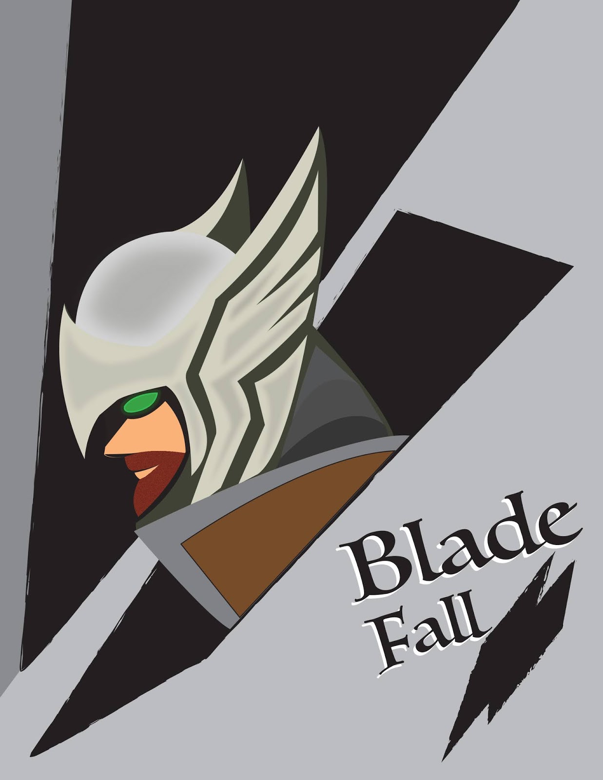
I have reworked some of the highlights and colors and I have added a background. I was going for a sort of book cover feel for this.
Because I am leaving for 4 days, I'm going to jump in here and give feedback without waiting for others to do so. Nick - a book cover has more type on it... like the book title, a subtitle, an author, etc. Are you sure this is the best use for this illustration? If so, please look at lots of other book covers to discover the elements necessary. Question - the image appears to be sticking up out of a black hole. Is this intentional? Consider moving the book title to the top of the page, not the bottom. What is that secondary black shape currently below the title? One more question... why is "Blade" more important than "Fall"? The change in size suggests it. So... look at covers, lots of them in this genre to help inspire you with this project.
Hi Nick, I see that you have put some more time into developing this illustration. The character is looking stronger. Maybe you could add some sort of illustrated background to place the character of the book into context. I like the name of the book, I think the font choice feels whimsical, is that the intended tone of the book?
Because I am leaving for 4 days, I'm going to jump in here and give feedback without waiting for others to do so. Nick - a book cover has more type on it... like the book title, a subtitle, an author, etc. Are you sure this is the best use for this illustration? If so, please look at lots of other book covers to discover the elements necessary. Question - the image appears to be sticking up out of a black hole. Is this intentional? Consider moving the book title to the top of the page, not the bottom. What is that secondary black shape currently below the title? One more question... why is "Blade" more important than "Fall"? The change in size suggests it. So... look at covers, lots of them in this genre to help inspire you with this project.
ReplyDeleteHi Nick, I see that you have put some more time into developing this illustration. The character is looking stronger. Maybe you could add some sort of illustrated background to place the character of the book into context. I like the name of the book, I think the font choice feels whimsical, is that the intended tone of the book?
ReplyDelete