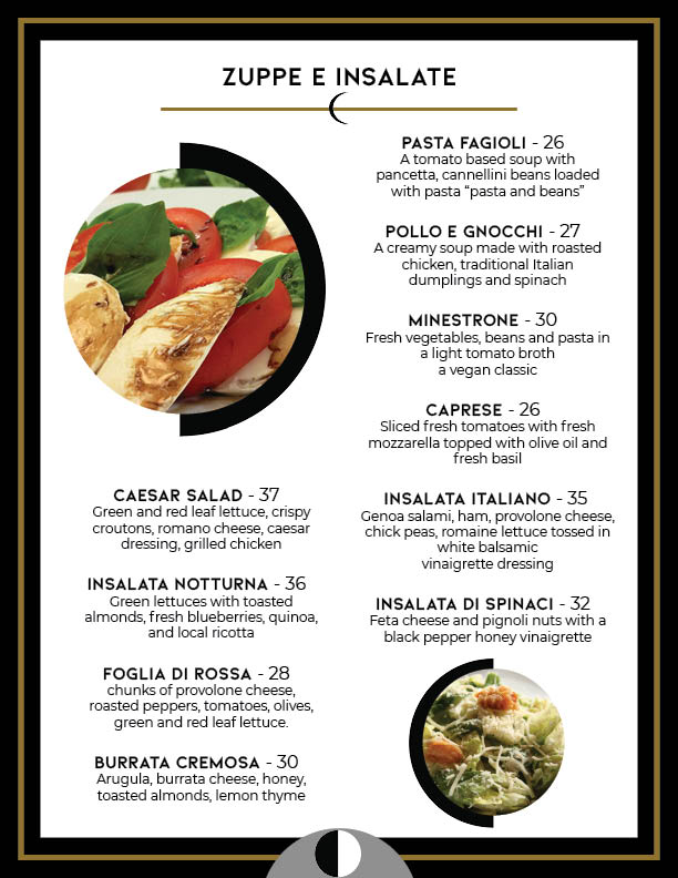
Menu Design
This is a gatefold menu. The cover has the name of the restaurant named Luna and the back is the image of the moon. My target audience is the middle/upper class. It is a classy, fancy and comfortable Italian restaurant. I chose the colors gold, white, black and grey as my color palette. The design is supposed to be minimalistic. I have made revisions on the Drink menu, the Soup and Salad menu (Zuppe E Insalate), and the front cover. I also made revisions on the business card.


I had really loved this menu in Publication Design last semester, Nikki. It looks so great and very professional. The moon (which also looks like a smiley face) adds so much to it. It all looks so real. The colors are great and so is the type and shapes. The only thing I'd tweak a little bit is: in some parts of the menu like the "La Luna" dish in dessert menu and some things in entree menus, there are some dish names that are a little too close to the description. Just nudging them away from each other a teeny bit will make it less crowded. Other than that, I can't think of anything else to fix. Looks great!
ReplyDeleteNow that this has moved into your portfolio as its own project (and away from class) - I'm wondering about whether you need the Minimalist definition under the photo of the moon. Would that not be a better place for the contact info, address, and/or website of the restaurant?
ReplyDeleteThis is still one of my favorite projects of yours! I love how far it has come, and it is interesting to see all of your design work on this change. One thing that that I might change is the zig zag lines going down the sides of the pages in the gold. I think its nice you want to tie it all together but it seems just a little bit random.
ReplyDelete