Posts

Showing posts from March 8, 2020

Project4 - Rework2

Image
I increased the point size of the green text to give even more contrast with the surrounding phrases and repositioned to the middle where the central focal point is. I redid the bruising effect using the burn, pucker, and bloat tool to minimize the eye area, swell the bruise, and darken the areas. I duplicated the text layer over the woman, brought the opacity down, and used a low opacity brush to erase around the bruised area. Any other suggestions and feedback would be greatly appreciated!

2 Covers reworked

Image
I have reworked the traditional and experimental versions of my book cover design projects.  In the traditional, I have explored the idea of using typography, rather than using a composited design.  I like it a lot more. In the experimental design,  I changed the type face and the clipping mask to look more like water. (The woman on the cover represents the circus performer who rides the elephant during performances, and who is a major character in the novel. I wanted the reader to be curious about this woman and why she is important.)  I look forward to feedback.  Thanks!

Updated Project 4

Image
I have moved down the text and made a couple other changes to it.

Project: PSA

Image
Here is my PSA campaign ad on endangered elephants. I have changed the colors on the text to yellow and I have made my own logo instead of using the World Wildlife Fund (WWF) logo. 

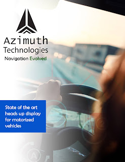
Azimuth Technologies- rework and clarification

Image
Rework of the azimuth technologies, which is a Gps technology Heads up display for vehicles.

Density duds - Final?

Image
Image
So here is a cleaner version of my logo design, thoughts?

Project 5 - with color variation

Image
So I have 3 color variants for my fifth project which was for The restaurant Sticky Dice, a place where you can go to eat, drink or even play a tabletop game such as Wizard of the coasts "Dungeons & Dragons"  A special thanks to Jenn who helped me come up with the Tagline "Sit for a Spell" which not only is  an invitation to stop, rest your feet and possibly visit for a while but for it is also a reference to the Long rest mechanic in Dungeons & Dragons which allows spellcasters to get their spell uses back.  I used the colorize feature on the Hue saturation filter to make all of the pictures a single color along with the addition of a color spray filter and by creating additional layers via color range to re-enforce the shadows to make it as if you are looking in the window of the establishment. Please give me feedback on these on not only the type placement but the logo, colors and filters as well.
Image
This is my Logo. Please tell me what do you think

Project 4 Masquerade

Image
The idea I have for this one is to turn it into a sort of Broadway-style I am currently using myriad as a subhead but I May want to play it. I will be changing the names for the theater and broadway as they are at this moment place holder text. I also noticed that i have to capitalise the Q for Quinn
Image
 These are my magazine adds to sell a imaginary headset which translates the voice of birds to human language.
Image
This my logo and now I have added color to it, and I kind of like the glow around it. The flower I drew on paper and then traced it over in illustrator so it could have a more vector based look.
Image
I have cleaned my magazine cover up a little bit and fixed some spelling, but I don't know what else to improve on it. Help? Im debating if I should have to words over her face or not...

Personal Logo--Color Options

Image
Hey guys! Here is my personal logo in color. I decided to keep the L in here as I really liked all three letters together with the flow of saying them. So, I have two options for how the colors should be. I did exactly what I envisioned with the gradients, but am torn on whether or not to have a white stroke to seperate them or to have them all just blend in that more paint-like way in Option 1. There still needs to be tweaking on the gradient paths and shapes as some are placed awkwardly still, but I feel the colors really capture what I'm going for. Feedback on which one you guys are more drawn to would be appreciated.

Update to logo

Image
I have removed the circle around the dragonfly and have increased the point size of the stroke used to make the spiral shapes.  I have added color into this update also.

Project 5

Image
This is my illustration for room 077. 

Project 4

Image
A design I did for typography class. The fonts I paired were Toms Handwritten New and Univers. Sagmeister's company is located in New York which is why I chose to use buildings in my design.