Posts

Showing posts from April 19, 2020

Final Project (#10): Kid's Clothing Design and Branding

Image
Hey guys. Here is my final portfolio project for this class. I really wanted to create something geared toward children and parents, as my other things were generally geared toward adults. I had the idea to create a custom illustrated logo and patterns for a gender-neutral kid's clothing line that was waterproof/stain-proof/mess proof. Otters have waterproof fur so I named the brand "Little Otters: Waterproof Playwear" and designed this logo for it. I went on to create mockups and ads for it, appealing to the parents that would be buying the clothing. I feel it's a good idea to encourage creative and messy play in clothes that are mess-proof. Feedback is appreciated! Thanks guys.

Project 3: Khoffee logo design (Final?)

Image
I did some minor tweaks to this logo and packaging designs. It was hard for me to really nit-pick some things because overall I really like this logo and package design. I fixed a couple spacing issues and touched up on the "beans" in packaging on the side sleeve. I experimented a little bit with adding more to the front of the packaging but felt it became to crowded and not minimalistic like the story behind the name "Khoffee" If you have any suggestions on what I could change/add please let me know! :) 

Package Design Mockup

Image
I wanted to include a package design to my portfolio so I decided to create my own after sun lotion brand. I made my own logo design in Illustrator with a gold gradient because I really like that aesthetic with tanning products. I made a patterned background with orange habiscus flowers to give a beach/tropical feel and to compliment the teal blue of the bottles gradient.

Sticky Dice Final

Image
Polished up the logo and moved some of the typography around and moved the "Sit for a spell" to the top area of the piece, also changed the word spell to a shade of orange for contrast as well as creating a focal point.
Image
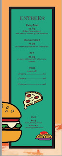
These are some pages of my menu design based on expressionism art style. I 'll post the rest later 
Image
https://jhowe6-mwcc.com/GID209/sghavimi/school/ hello every one. please check this web that I created for Service Learning project.

Project 8: Hair Dye Brand

Image
Hey guys. This is PRISM. It was a brand I created in one of my web classes for an e-commerce site and idea. It's a vibrant hair dye with a rainbow colors and color conditioners. The brand is completely different than what it once once. See the old logo at the bottom to see the difference. I wanted to incorporate fractal shapes like a prism but also hair textures. I've also mocked up the color conditioner and an ad for the signature pink hair dye as well in a unique way, keeping the hair the main part of the model we see. Feedback is much appreciated!  This was the old logo: 

Moondog Revisions

Image
  So, upon further revision of the Moondog project, I added a new font to replace the Century Gothic subhead. I was able to find this Hippy-ish, almost Celtic font called "Volute", which I think fits the mood of Moondog's music and aesthetic. I have two different versions. One that maintained the original color scheme of the first revision, and another, which was just experimentation with a triad color palette. I'm not entirely sure I prefer one over the other, but at the very least, I'm Happy with the composition and typeface pairing. If anyone has any suggestions for which would be better for my portfolio, I would be stoked to hear it!

Ocean

Image
Just something I made for fun. It an image that showcases how beautiful the ocean is.
Image
This is my logo for the Ayer Library design. I need some suggestions on where to put the "Ayer Library" type, and any other ideas and feedback would be great! Thanks!
Image
My final cover letter look. There is a white border around the orange accompanied by the logo in the top right corner.
Image
My final resume design. The overall layout has not changed but the logo has changed color. I think this way my logo and brand stands out better and pops with all the grey behind it.
Image
This is my final design for my business card package. Hope it looks good! The front has my name and the full logo on it and the back has the graphic designer label on it.

Toner Magazine cover draft

Image

Book Cover Design-changes made

Image
I made suggested changes by creating more of a typographic composition with the title.

Cafe logo concept, Bottomless Brews and Bites

Image
So I'm making an advert using this logo. I am planning on using different colors when I actually make the add this is mainly as a base, any thoughts?

Update to Evil Queen Meadery

Image
I made some changes to my meadery labels.  I added an embossing effect to make the color elements pop out more against the black background.  I want to keep the hues different on each label as this is the concept of the project.  I changed the mockups to a different set that shows the three bottles in one composition and then have included another composition that just shows the labels.   Sign for the Evil Queen Meadery Three Labels not on mocked up Three labels on bottle mock up

Update to Earthrise

Image
Hi everyone!  Thanks for the feedback.  It really helps to have a new set of eyes on a project!  I made the recommended change to the title of the festival to have it better match the aesthetic of the rest of the poster. To accomplish this I chose a more eroded/grunge typeface. I played around with different hues for the typeface and always came back to this  less saturated white looking the most readable. I also put a sunburst behind everything that emphasizes my concept. I am pretty happy with how it looks now.  Any additional ideas appreciated!